The following proposal was made by two of the Alpaca associates, Giulia Bonora and Daniele De Rosa, for the public call for the design of a wayfinding and information system for the Business Improvement District of the Cento municipality. The contest was organized by Aiap, Associazione Italiana design della comunicazione visiva on behalf of the Cento municipality.
The project ranked second in the contest, and it has been awarded with a special mention by the committee.
Concept
The proposal explores the potential of cross-media sign system, with the aim of communicating all the required information in each artifact. One of the key features of the project is the usage of a cartographic visualization which suits every type of media (offline and online) and application (from the printed maps to the monument plates).
The core components of the design process are the research on and the usage of the elements of the territory identity and the focus on the user experience.
Identity
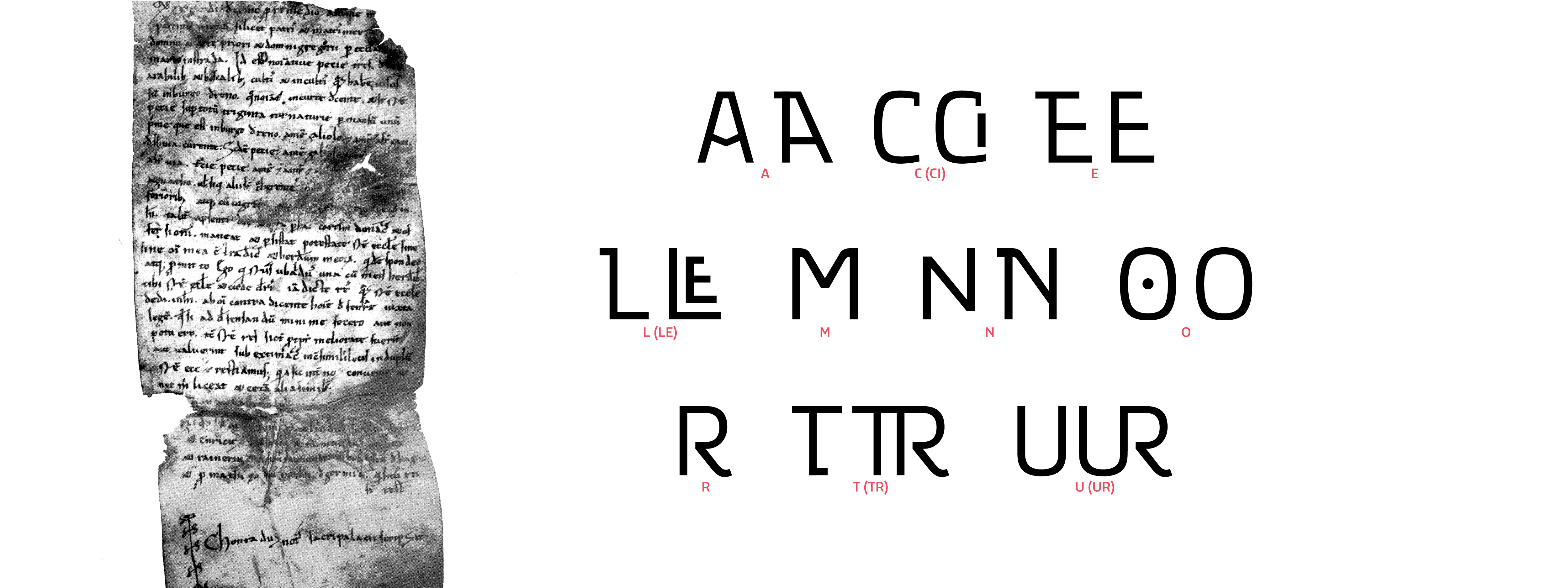
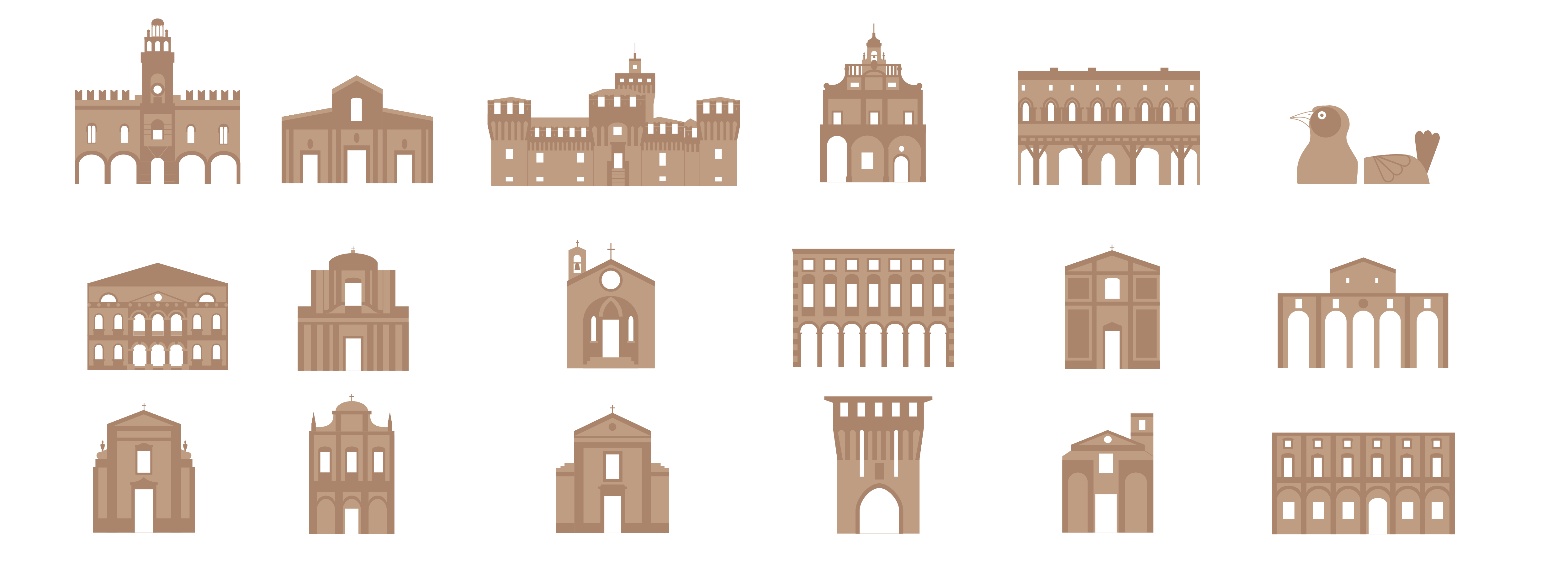
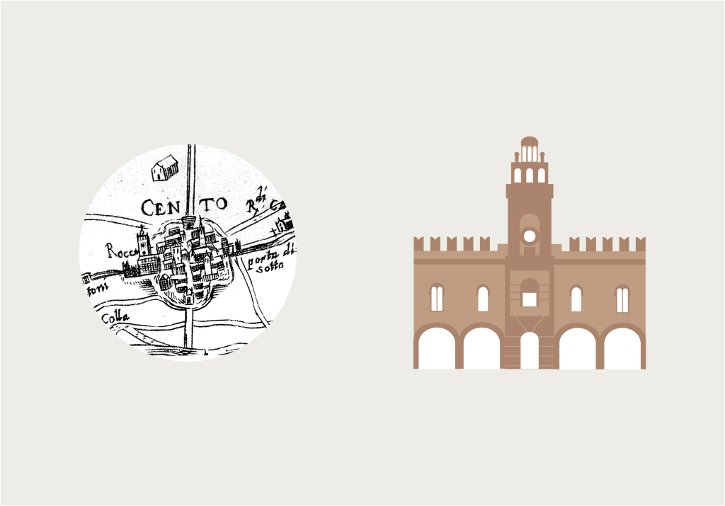
The basic graphical elements, designed to make the whole system consistent, were chosen following the visual and historical suggestions provided by the city of Cento. The minimal illustrations of the buildings were designed following the iconography shown by the ancient cartography of the city.
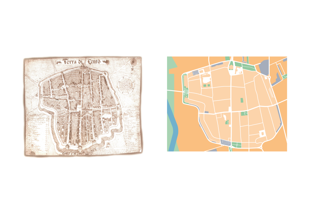
By analyzing the cartographic references, it emerged the historical and iconographic importance of the map “Terre di Cento” (Lands of Cento), which inspired the South-West orientation of the proposed map in its main applications (overview map placed at the North-West of the city, monument plates and digital designs). The overview maps have different orientation basing on the positioning of the city entrances were they would be posted up, in order to provide the users with a clearer understanding of the reference system.
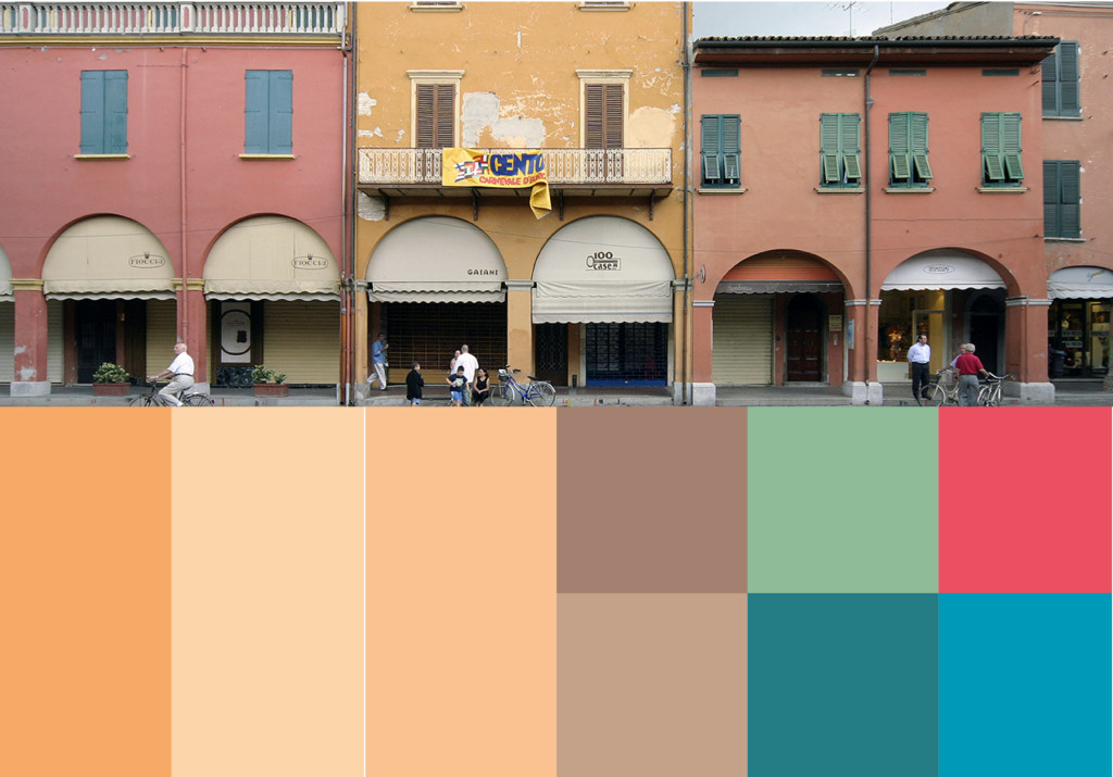
Color is a further identity elements, which was kept consistent with the territory and the city appearance by sampling the color palette from photos of buildings or aerial views of the territory.
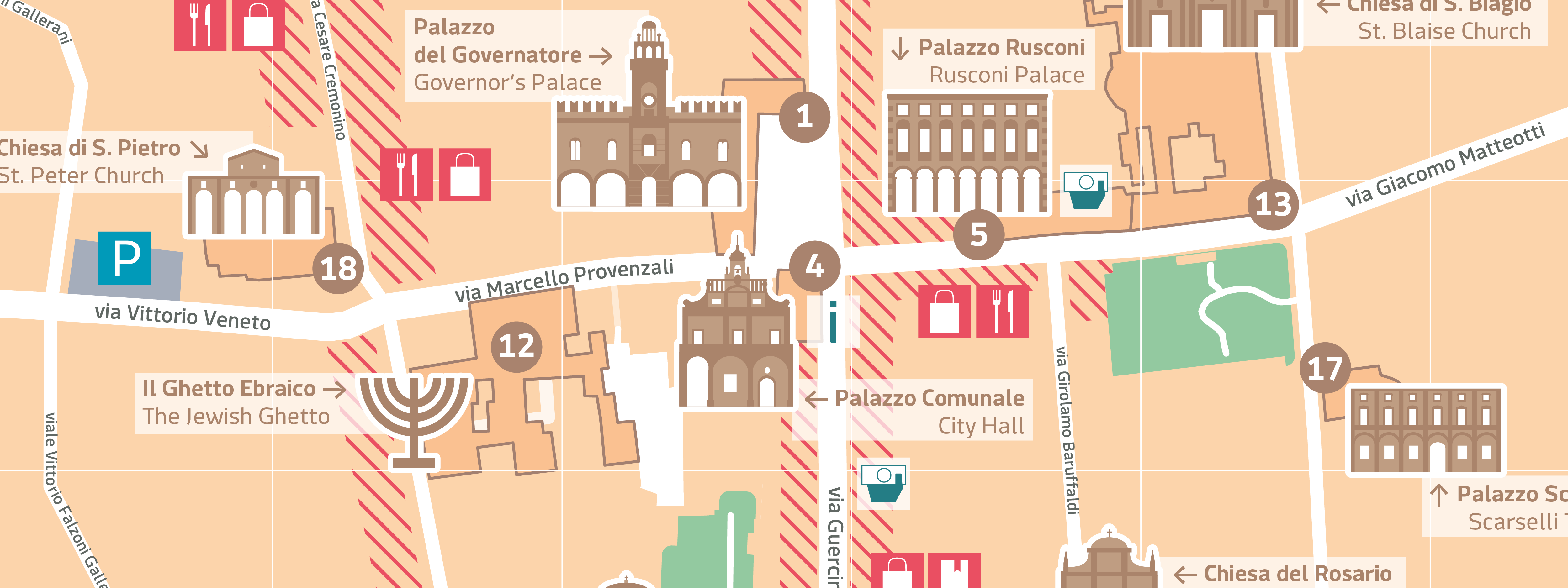
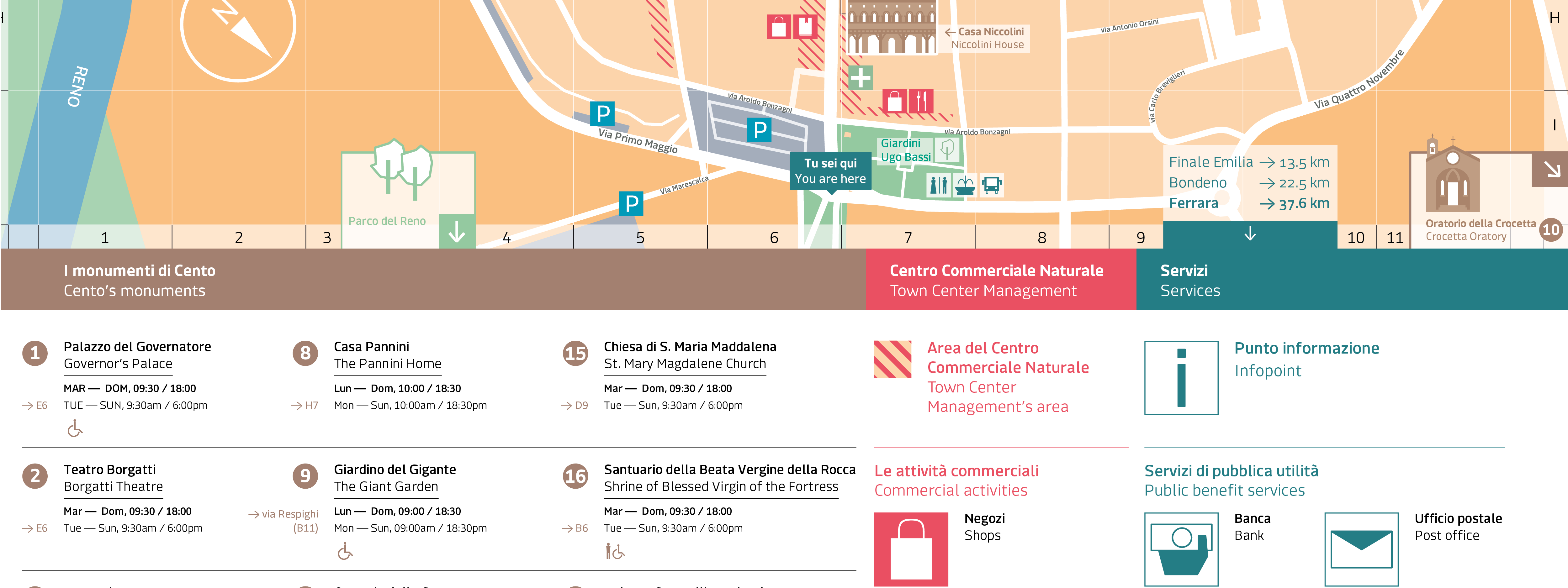
The map
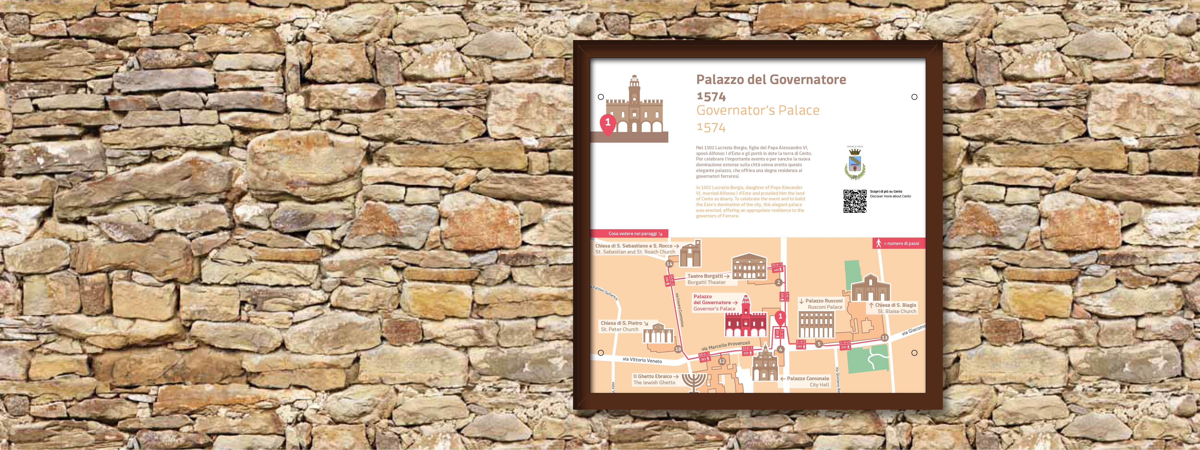
In the map are represented the cultural and artistic heritage of the city, the public utility services and the Business Improvement District. The monuments are represented by illustrations depicting their facade, together with their labels written both in Italian and English and with sequential numbering (linked to the legend).
The areas embracing the Business Improvement District are highlighted by using accent color and texture, and they suggest where to find businesses grouped by category represented by pictograms.
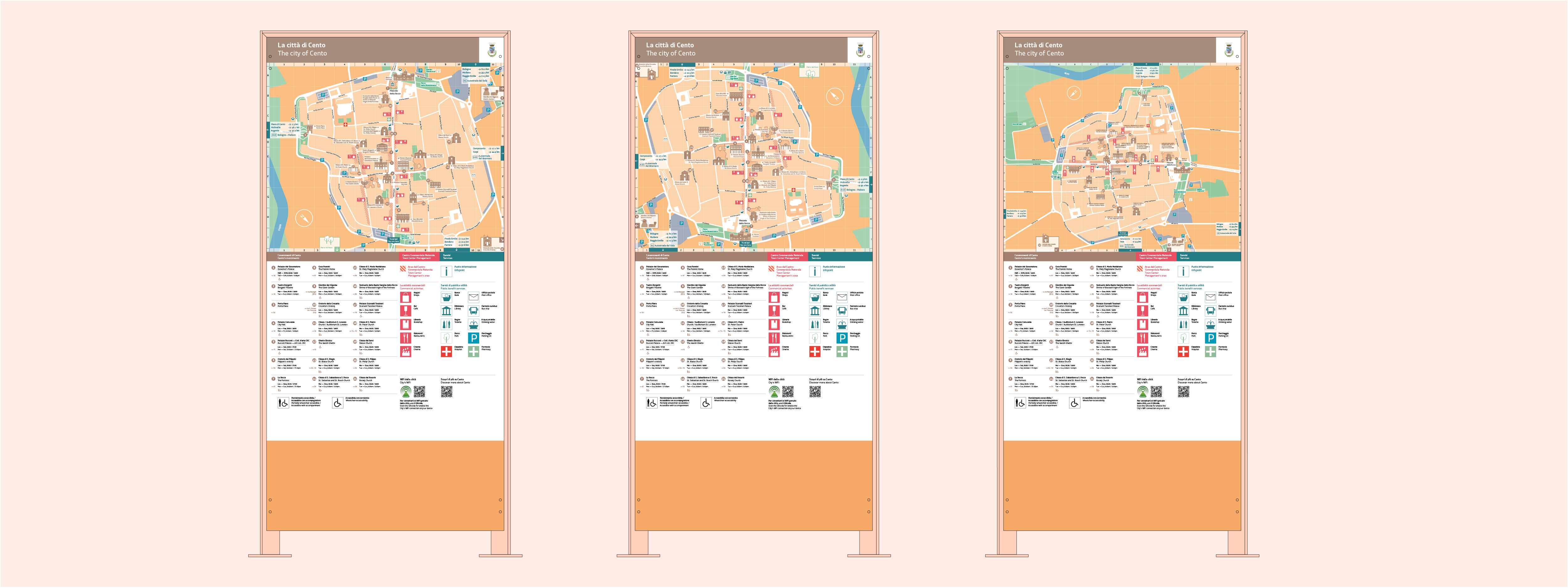
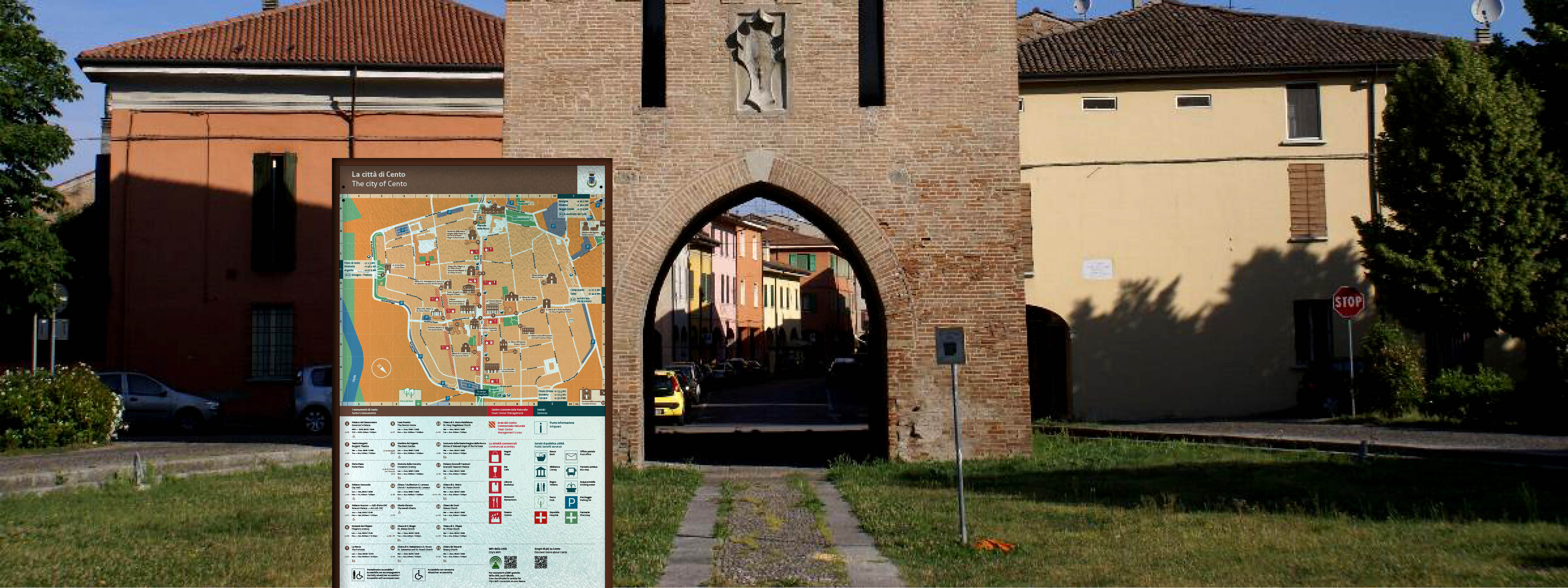
Monument plates
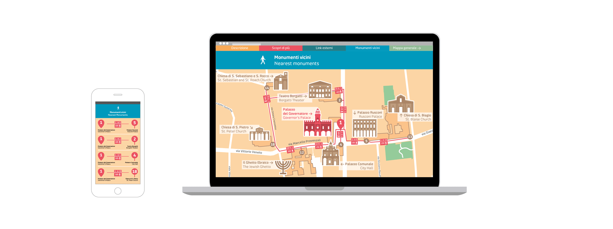
In the plate, together with the building information, it is drawn a part of the overall map, which shows the nearby monuments. A series of paths starts from each monument and they direct the users to the nearest points of interest. The paths length is measured in steps.
Web page
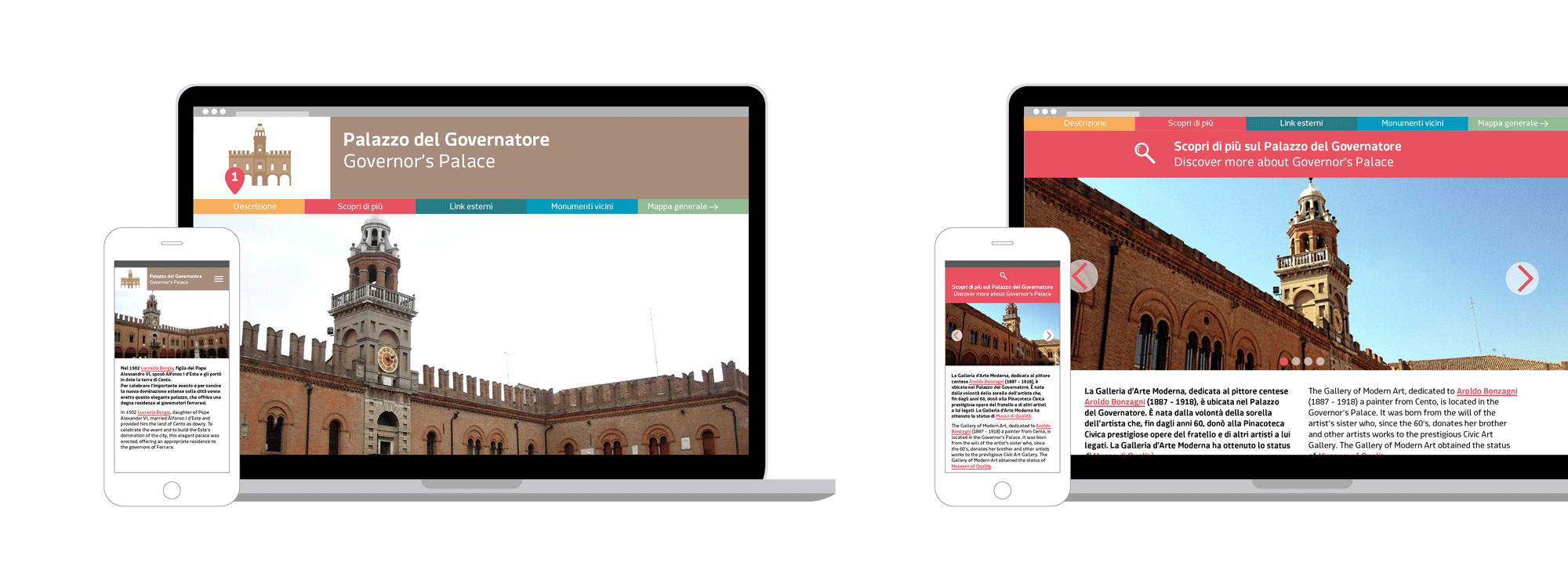
The QRcodes printed on the monument plates allow the users to access the web page of the monument. Each monument web page shows several sections, which are related to the historical description of the building, the pictures, the peculiarities, the external links to galleries and videos, and the map shown on the plate (but here it is interactive and usable on smartphone).
Logo “Cento — Centro Commerciale Naturale”
(Logo “Cento – Business Improvement District”)
The proposal for the Business Improvement District logo, which is consistent with the whole project proposal, takes into account the identity elements of the Cento typography tradition. The shapes coming from historical documents and from ancient inscriptions, which can still be found in the city, inspired a brand new typeface, which is consistent with the other brand application.